Online Image Formats
Table of contents
On the TUD website, all uploaded images are automatically scaled to the corresponding output size. The image sizes specified below are the output sizes. It is recommended to upload the images in a higher resolution that corresponds to the same format. In most cases this is 16:9.
When scaling images on the website, there are three different behaviors depending on which box or element the image is used in. These are described below.
Unchanged image displays
Unmodified image displays are characterized by the fact that they are displayed in the aspect ratio of the original image, i.e. your image is not cropped. The images are merely scaled (reduced in size) for output and the amount of data is optimized. For these displays, you can upload your image in its original state without hesitation. The following boxes contain unchanged images:
| Element | Aspect ratio | Minimum width |
|---|---|---|
| Image (half content width) | free | 480 px |
| Image (full content width) | free | 630 px |
| Main image news article | free (16:9 is recommended for a simultaneously optimized display in the news teaser box) | 630 px |
| Picture gallery box | free | 480 x 270 px |
| Contact box | free (should be landscape format) | 314 x 190 px |
| Logo box | free | 240 x 130 px |
| Logo of a web area | free | 240 x 50 px |
Cropped images
Cropped images are always displayed in the same aspect ratio regardless of the screen resolution. However, the image is cropped for display. To ensure optimum image quality, the image should be uploaded in at least the specified image size. This can also be the original size of the image or a 16:9 section of it. If your image has an aspect ratio other than 16:9, it will be scaled for output for cropped image displays so that a 16:9 frame fits completely into the image. Excess areas are cut off symmetrically.
| Element | Aspect ratio | Minimum size |
|---|---|---|
| Intro box overview page | 16:9 | 300 x 168 px |
| Teaser box for content | 16:9 | 480 x 270 px |
| Banner box | 16:9 | 480 x 270 px |
| Recommendations | 16:9 | 480 x 270 px |
| Image changer box with text | 1:1 / 16:9 | 480 x 480 px |
Resolution-dependent image displays
Resolution-dependent image displays are scaled and cropped differently depending on the screen resolution. As a result, the visible areas of the image vary. It is important to position the main content of the image so that it is always visible. The following schematic illustration shows you which areas of the image are cropped depending on the resolution and which are always visible. Please note that you should provide your image in the specified minimum size or the corresponding aspect ratio in order to maintain the guaranteed areas of the schematic illustrations.
Introbox Homepage
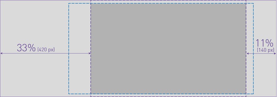
Aspect ratio: 128:45 (desktop), varying (tablet, smartphone)
Minimum size: 1280 x 450 px
Image changer box with text
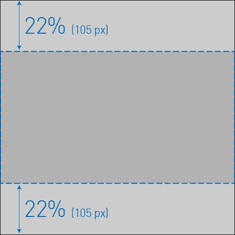
The following information applies if you have activated the "Crop images" option for the image changer box with text.
Aspect ratio: 1:1 (desktop, tablet), 16:9 (smartphone)
Minimum size: 480 x 480 px
Detailed information on the use of images on the website can be found in the guidelines "Guidelines for images on the TU Dresden website".
When photos and images are used on the website, the author must be fully credited. This must be entered as "Copyright" in the relevant section. In the case of images from so-called stock archives, the information usually consists of the stock archive and the pseudonym of the author, e.g. PantherMedia / Andriy Popov. Student works and the image material they contain are also protected by copyright.
In the past, missing copyright information has led to legal disputes and associated costs for the TUD, as copyrights have been infringed. We therefore urge you to pay attention to the correct copyright information.