09.06.2026
Affektive und multi-perspektivische Kommunikation mit Karten
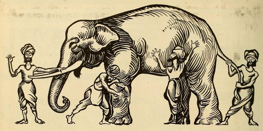
Die blinden Männer und der Elefant
Karten lassen sich mit jenem Märchen vergleichen, in dem drei blinde Männer mit verbundenen Augen gebeten werden, einen Elefanten zu beschreiben. Der eine Mann berührt den Schwanz des Elefanten und sagt: „Ein Elefant ist wie ein Seil.“ Ein anderer berührt das Bein des Elefanten und sagt: „Ein Elefant ist wie ein Baumstamm.“ Der dritte Mann berührt den Rüssel des Elefanten und sagt: „Ein Elefant ist wie eine Schlange.“ Keiner von ihnen liegt völlig falsch, aber keiner hat vollkommen recht, denn keiner von ihnen kann das gesamte Tier sehen.
Ähnlich verhält es sich mit Karten. Karten können niemals die ganze Wahrheit wiedergeben, doch sind sie deswegen nicht falsch. Ebenso kann es sein, dass der Betrachtende bewusst in seiner Wahrnehmung des Elefantenbeins bestärkt wird, während andere Körperteile unkenntlich gemacht werden; oder dass der Betrachtende absichtlich vom Elefantenbein abgelenkt wird und dergleichen. Dieses Gedankenexperiment diente als Ausgangspunkt für eine neue Lehrveranstaltung.
Im Wintersemester 2025/26 fand erstmalig das Modul „Affektive und multi-perspektivische Kommunikation mit Karten“ statt, welches fortan für die zwei Masterstudiengänge Cartography und Geoinformationstechnologien angeboten wird. Das Modul ist sehr Design-orientiert und vermittelt fundierte Kenntnisse zu Methoden und Ansätzen zum gezielten Einsatz von Grafikdesign und Visualisierung, um mit thematischen Karten spezifische Zielgruppen anzusprechen oder eine bestimmte Botschaft zu vermitteln. Folgende Themen werden behandelt:
- Farbe
- Psychologische Prinzipien im Design
- Emotionales Design
- Lebendige Kartographie
- Persuasives Design
- Persuasive und manipulative Kartographie
- Virale Kartographie
- Kritische Kartographie
Am Ende des Semesters ist eine Projektarbeit einzureichen. Ziel ist es, zwei statische thematische Karten zum selben Thema zu erstellen, die unterschiedliche Perspektiven darauf zeigen und somit unterschiedliche Absichten verfolgen sowie verschiedene Botschaften vermitteln.
Im Folgenden werden sechs Projektarbeiten gezeigt, die jedoch nicht unbedingt die Meinung der jeweiligen Autorin oder des jeweiligen Autors widerspiegeln.
Gabriela Spriestersbach (MSc Cartography)
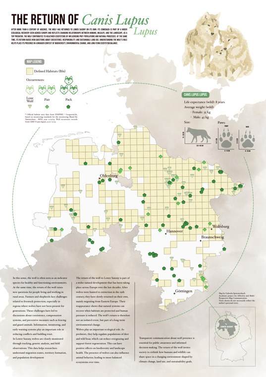
Karte 1 von Gabriela Spriesterbach
Dieses Projekt befasst sich mit der Rückkehr des Wolfes (Canis lupus lupus) nach Niedersachsen – ein Thema, das in der öffentlichen Debatte zu starken und kontroversen Meinungen geführt hat und somit die Möglichkeit bietet, zu untersuchen, wie Karten unterschiedliche Standpunkte darstellen können, anstatt eine einzige neutrale Wahrheit zu vermitteln. Die erste Karte stellt die Rückkehr des Wolfes als positive ökologische Entwicklung und als Zeichen für die Erholung der Umwelt dar und richtet sich an ein Publikum, das sich für Umweltschutz interessiert. Die Karte zeigt den Wolf als natürlichen Bestandteil des Ökosystems und hebt die Koexistenz und die Artenvielfalt hervor.
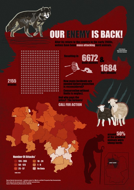
Karte 2 von Gabriela Spriesterbach
Die zweite Karte stellt den Wolf als Bedrohung für die Landwirtschaft, die Existenzgrundlagen im ländlichen Raum und die Sicherheit dar und richtet sich an diejenigen, die sich mit Landwirtschaft, dem Leben auf dem Land und politischen Entscheidungen befassen. Sie konzentriert sich auf Verluste und Dringlichkeit und spiegelt die Bedenken von Landwirten und Politikern wider, die strengere Kontrollmaßnahmen fordern.
Frederica Ballardini (MSc Cartography)
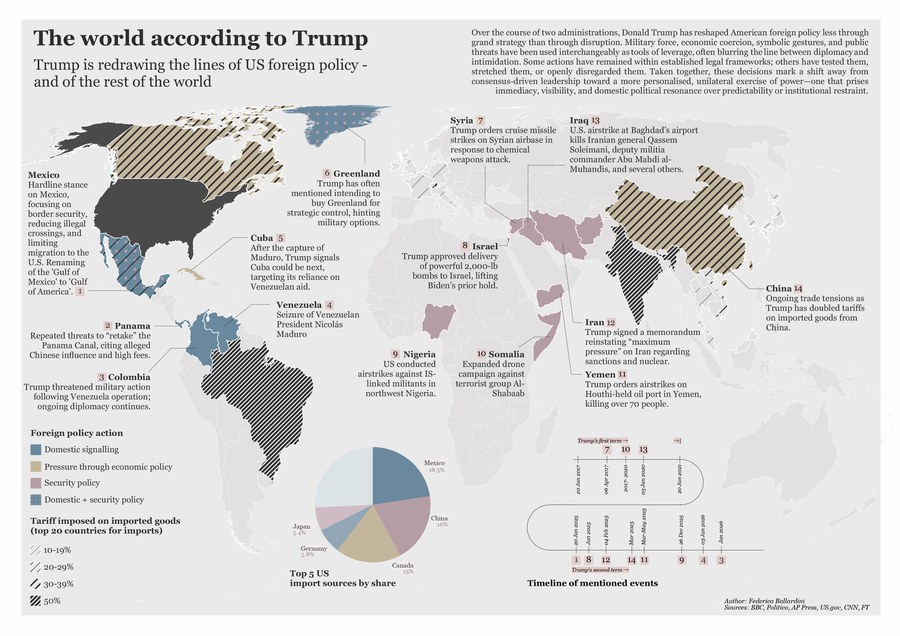
Karte 1 von Frederica Ballardini
Diese beiden Karten veranschaulichen die „Multi-Perspektiven“, die die außenpolitischen Entscheidungen eines Präsidenten umgeben. US-Präsident Trump stand oft wegen seiner provokanten Handlungen im Rampenlicht, und seine internationale Legitimität scheint zunehmend brüchig zu werden – eine Vorstellung, die sich in der ersten Karte widerspiegelt. Sie könnte in einem Magazin für internationale Politik wie The Economist erscheinen.
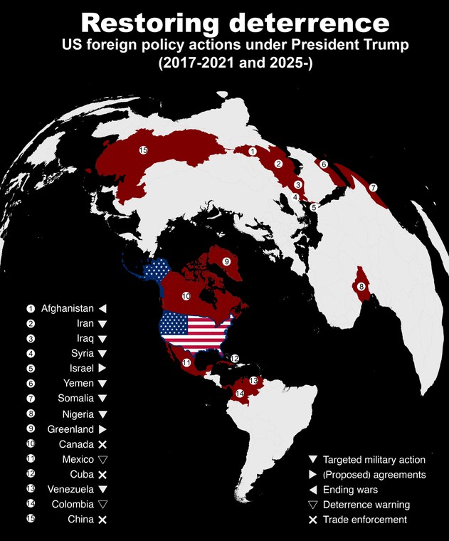
Karte 2 von Frederica Ballardini
Trumps Rhetorik folgt konsequent einem „America first“-Ansatz, der in Krisenzeiten oft noch verstärkt wird. Diese Perspektive wird in der zweiten Karte dargestellt, die in sozialen Medien oder bei einer Pressekonferenz seines PR-Teams erscheinen könnte.
Lucie Kluwe (MSc Geoinformationstechnologien)
Karte 1 von Lucie Kluwe
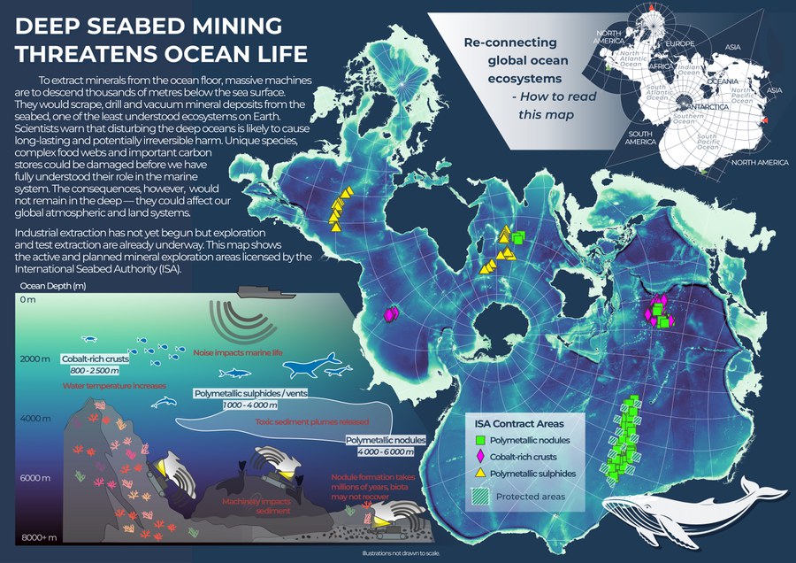
Diese beiden Karten befassen sich mit dem Tiefseebergbau. Die erste Karte ist als digitales Poster für eine Umweltschutzorganisation wie Greenpeace oder den WWF vorgesehen. Ihre Zielgruppe ist ein weltweites Publikum, das umweltbewusst ist und sich besonders für den Schutz der Natur und der Tierwelt interessiert.
Karte 1 von Lucie Kluwe
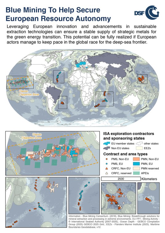
Die zweite Karte ist eine Kartensammlung, die an EU-Politiker auf einer Konferenz verteilt werden soll, auf der das weitere Engagement und die Fortschritte der EU-Mitgliedstaaten im Bereich der Mineralgewinnung aus der Tiefsee diskutiert werden. Im Gegensatz zur linken Karte, die sich auf die Ozeane im globalen Sinne konzentriert, betrachtet diese Karte die Situation auf Länderebene.
Emiel Verté (MSc Cartography)
Karte 1 von Emiel Verté
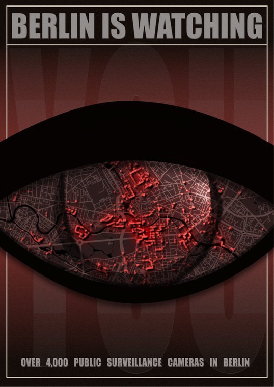
Dieses Projekt befasst sich mit Überwachungskameras in Berlin. Die erste Karte ist ein dystopisches Plakat im Stil von „1984“, das darauf abzielt, das Bewusstsein zu schärfen und das Gefühl zu vermitteln, beobachtet zu werden. Es richtet sich an Aktivisten, Datenschützer und Bürgerrechtsorganisationen und soll eine Debatte über Überwachung, staatliche Übergriffe und die Normalisierung der Überwachung im öffentlichen Raum anstoßen. Das Ziel ist nicht ein detailliertes räumliches Verständnis, sondern unmittelbares Begreifen und emotionale Wirkung.
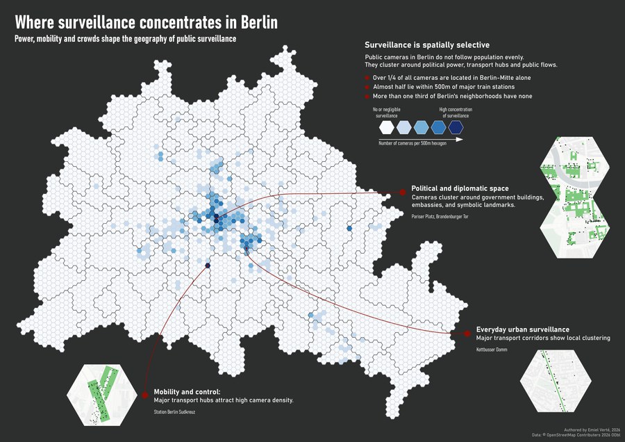
Karte 2 von Emiel Verté
Die zweite Karte bietet eine kontextuelle und analytische Perspektive auf denselben Datensatz. Sie kann als Antwort von der Stadtverwaltung, Forschern oder Journalisten gesehen werden und konzentriert sich darauf, das „Warum“ und „Wo“ der Kamerapositionierung zu erklären. Zu ihrer Zielgruppe gehören interessierte Anwohner sowie Journalisten, Forscher, Stadtplaner und politikinteressierte Leser, die die Überwachungsmuster innerhalb der räumlichen Struktur der Stadt verstehen wollen.
Thijs van Laar (MSc Cartography)
Karte 1 von Thijs van Laar
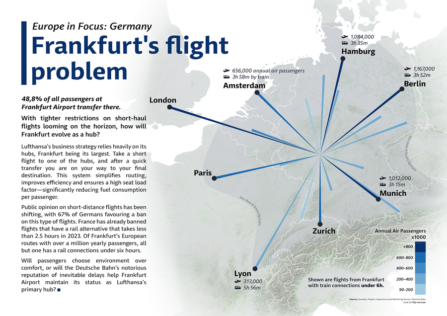
Diese beiden Karten basieren auf einem Datensatz zu Flugstrecken zwischen Partner- und Großflughäfen in Deutschland. Die erste Karte richtet sich an die Leserschaft eines modernen, seriösen Magazins, typischerweise an Menschen im Alter von Mitte zwanzig bis Mitte fünfzig mit eher theoretischem Hintergrund. Sie zielt darauf ab, zu informieren und aufzuklären, ohne dabei eine klare Position zu beziehen. Dabei werden relevante Daten präsentiert und am Ende eine Frage gestellt, um zur Diskussion anzuregen.
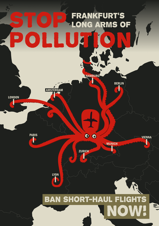
Karte 2 von Thijs van Laar
Die zweite Karte vermittelt eine klare Botschaft zu Kurzstreckenflügen und richtet sich an ein Publikum, das Klimaschutzmaßnahmen befürwortet und für Darstellungen der Ungleichheit zwischen Vielfliegern und anderen empfänglich ist. Sie soll Wut und Besorgnis über die Folgen von Kurzstreckenflügen hervorrufen und appelliert an das Gefühl der Ungerechtigkeit.
Devita Remala Sari (MSc Cartography)
Karte 1 von Devita Remala Sari
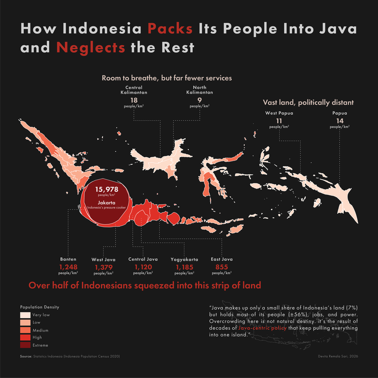
Dieses Projekt befasst sich mit der Bevölkerungsdichte in Indonesien. Die erste Karte richtet sich an die breite Öffentlichkeit, insbesondere an Nutzer sozialer Medien und Laien. Sie stellt die Bevölkerungsdichte als politisches und soziales Problem dar und hebt die Konzentration auf Java hervor, während andere Regionen zurückbleiben. Ziel ist es, Frustration zu wecken, Diskussionen anzuregen und die Zentralisierung sowie die ungleiche Entwicklung zu hinterfragen.
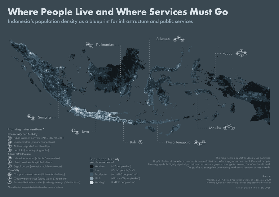
Karte 2 von Devita Remala Sari
Die zweite Karte richtet sich an Entscheidungsträger und Planer im öffentlichen Sektor. Sie präsentiert die Bevölkerungsdichte nicht nur als Herausforderung, sondern auch als Chance für die Planung. Eine konzentrierte Nachfrage ermöglicht effiziente Modernisierungen, während dünn besiedelte Gebiete andere Ansätze erfordern. Sie stellt die Bevölkerungsdichte als Chance zum Handeln dar.